It's a relatively small thing, but still something that drives me bonkers. I love the blog "Wave at the Bus", which documents the costume a Dad wore every day to embarrass his teenage son on the way to school in the morning, but as I'm navigating the archive I'm being repeatedly aggranoyed by a dodgy bit of layout.
The 'older posts' link is stuck to the bottom of the (very small) number of posts displayed per page, but the navigation bar on the right-hand-side is so full of gubbins that it bloats the page out several more screen-depths. This means that as you read, you have to ensure that you stop scrolling some indeterminate time before you hit the bottom, so that you can find the 'next' button.
This can be easily remedied by changing the number of posts displayed by altering the URL, but still, don't default to annoying, people!
Thursday, 16 June 2011

Tuesday, 14 June 2011
The Wordpress saga begins...
As previously mentioned, I'm using Wordpress to "power" my site. As the label "content management system" might suggest, it manages your content for you. I've found that this becomes essential as soon as you move beyond the most simple, static websites, as uploading content and editing pages is an epic faff.
Once installed (theoretically taking you 5 minutes, but I've been assured that's only if your sysadmins are brainless lugs and don't care about security) Wordpress provides a back-end to manage your site and its contents. This occurs at two levels - the straightforward, everyday content management and layout, and the nitty-gritty of automating the html and css.
Logging in presents you with a dashboard containing reports on any recent activity on the site, a quick post facility and access to the site's controls over posts, pages, links, media and comments. This lets you create, upload, edit and rearrange things to your heart's content from within your web browser - such a soothing relief after having to run at least three separate applications (including ssh and ftp) whenever I wanted to modify one of my old sites. What I'm interested in at the moment, however is the Themes.
Wordpress allows you - if you so desire - to entirely wash your hands of all things codey. You can create your contents in a WYSIWYG editor, pick a 'Theme' (layout, widgets, colours, backgrounds etc) and a host of .php will edit everything together for you.
There are countless myriad themes out there, even if you only count the free ones. After window-shopping a few over the past couple of weeks, I've tentatively selected Minimatica from One Designs, as it has a really interesting gallery structure. I had hoped to use static pages for much of the content, but it looks like I might need to instead create another kind of blog-post template, and remove some of the date referencing. There are other changes which I will list later (eg. changing the solid blocks for transparent ones), but for the time-being, I have a page which looks a little like this:

I'll need to get deep in the .php files to isolate the relevant code, but it should be do-able. Obviously there's a lot of work required to make it look anything like this:

but strangely, I'm looking forward to it!
Once installed (theoretically taking you 5 minutes, but I've been assured that's only if your sysadmins are brainless lugs and don't care about security) Wordpress provides a back-end to manage your site and its contents. This occurs at two levels - the straightforward, everyday content management and layout, and the nitty-gritty of automating the html and css.
Logging in presents you with a dashboard containing reports on any recent activity on the site, a quick post facility and access to the site's controls over posts, pages, links, media and comments. This lets you create, upload, edit and rearrange things to your heart's content from within your web browser - such a soothing relief after having to run at least three separate applications (including ssh and ftp) whenever I wanted to modify one of my old sites. What I'm interested in at the moment, however is the Themes.
Wordpress allows you - if you so desire - to entirely wash your hands of all things codey. You can create your contents in a WYSIWYG editor, pick a 'Theme' (layout, widgets, colours, backgrounds etc) and a host of .php will edit everything together for you.
There are countless myriad themes out there, even if you only count the free ones. After window-shopping a few over the past couple of weeks, I've tentatively selected Minimatica from One Designs, as it has a really interesting gallery structure. I had hoped to use static pages for much of the content, but it looks like I might need to instead create another kind of blog-post template, and remove some of the date referencing. There are other changes which I will list later (eg. changing the solid blocks for transparent ones), but for the time-being, I have a page which looks a little like this:

I'll need to get deep in the .php files to isolate the relevant code, but it should be do-able. Obviously there's a lot of work required to make it look anything like this:

but strangely, I'm looking forward to it!
Looking back into my past....web designs.
As you can probably tell from the lack of posts since last week, becoming and remaining organised hasn't got any easier. That's not to say I haven't been working on the 'site though!
Before I tell you what I've been doing though, let me explain myself a little. I'm a bit of an arty-farty type, and have been drawing, painting and creating for longer than I can remember. I started making websites to share my images in high school, creating simple little html-only sites with tables and the like.

At undergraduate I tried again, learned Perl, and created a new website on my groovy domain 'www.entanglement.co.uk'. This included writing some nifty perl-powered widgets such as a chat form and notepad. I also created one which would match up an image with its text discription and create a page to display both, so I didn't have to code every single one by hand. As you can tell, I decided early on that hand-coding every image gallery page was a mug's game.
 Eventually discovering CSS made my layouts a lot prettier, but alas didn't help overly much with the automation - it was still necessary to ssh and ftp into the server to edit pages and upload files. In the years since, I've worked on-and-off on various incarnations of Entanglement, but I've always been stymied by difficulties with managing the upload and display of large numbers of images, their accompanying descriptions and complex web of interconnections and dependencies. This added a prohibitive amount of time to every attempted update.
As you might be able to tell from the images so far, I've just been taking a nostaligic stroll through Entanglement using the Wayback Machine (a fabulous resource, check it out any time you want some netstaslgia), cringing at my '03 self's idea of complete sentences, crying over broken links and being vuagely amused by what I thought were appropriate taglines:
After this last crushing defeat, and without the time or inclination to recreate my masterpiece and set up a proper content management, I made a simple static page, which links to content which I do update, based around other people's CMSs (blogger and DeviantArt).

As you've probably figured out by now, I didn't take this course to learn HTML and CSS - I've done it before, and I've had more than my fair share of dead-end web projects that don't survive the long slog of manual updating beyond the initial frenzy of setup. Instead, though I will be using the skills I learned in these areas to control the appearance and behaviour of my site and its contents, my main driver is something a bit more ambitious. I want to use this project as a goad to myself to set up and use a CMS-based website for both personal and science communication content, including this project.
With this intent in mind, I've spent the past couple of weeks working with my partner to set up Wordpress on his server. It's been an interative, collaborative process: he installed the thing, I struggled with it for a while then told him what was broken, he cursed and fixed it, rinse, repeat. I owe him some cookies, I think. In any case, as of this morning, it is now apparently mostly working! There was much rejoycing.
Now comes the long, slow process of customising a Wordpress theme, but I think this post is quite long enough for now.
Before I tell you what I've been doing though, let me explain myself a little. I'm a bit of an arty-farty type, and have been drawing, painting and creating for longer than I can remember. I started making websites to share my images in high school, creating simple little html-only sites with tables and the like.

At undergraduate I tried again, learned Perl, and created a new website on my groovy domain 'www.entanglement.co.uk'. This included writing some nifty perl-powered widgets such as a chat form and notepad. I also created one which would match up an image with its text discription and create a page to display both, so I didn't have to code every single one by hand. As you can tell, I decided early on that hand-coding every image gallery page was a mug's game.

As you might be able to tell from the images so far, I've just been taking a nostaligic stroll through Entanglement using the Wayback Machine (a fabulous resource, check it out any time you want some netstaslgia), cringing at my '03 self's idea of complete sentences, crying over broken links and being vuagely amused by what I thought were appropriate taglines:
- I am the nemesis of the vole
- Premium Cardboard.
- clickclick, little clickers
- A distinct tendency to orange.
After this last crushing defeat, and without the time or inclination to recreate my masterpiece and set up a proper content management, I made a simple static page, which links to content which I do update, based around other people's CMSs (blogger and DeviantArt).
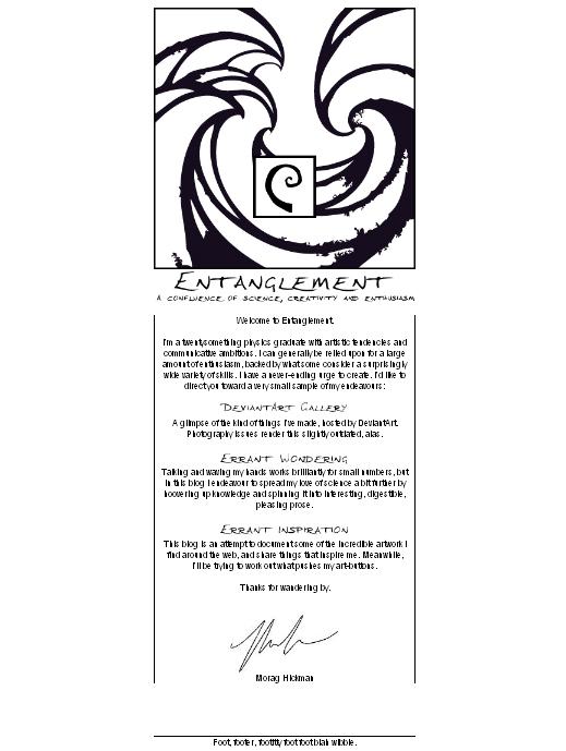
As you've probably figured out by now, I didn't take this course to learn HTML and CSS - I've done it before, and I've had more than my fair share of dead-end web projects that don't survive the long slog of manual updating beyond the initial frenzy of setup. Instead, though I will be using the skills I learned in these areas to control the appearance and behaviour of my site and its contents, my main driver is something a bit more ambitious. I want to use this project as a goad to myself to set up and use a CMS-based website for both personal and science communication content, including this project.
With this intent in mind, I've spent the past couple of weeks working with my partner to set up Wordpress on his server. It's been an interative, collaborative process: he installed the thing, I struggled with it for a while then told him what was broken, he cursed and fixed it, rinse, repeat. I owe him some cookies, I think. In any case, as of this morning, it is now apparently mostly working! There was much rejoycing.
Now comes the long, slow process of customising a Wordpress theme, but I think this post is quite long enough for now.
Tuesday, 7 June 2011
Organisation
I've been finding it difficult to keep track of tasks and time lately, and this disorganisation has been making my work suffer from chaos-creep. Fortunately my frighteningly motivated Maternal Unit visited yesterday, administered a swift metaphorical kick to the backside and imparted some of the organisation-foo which helped her obtain an A1 grade for her own Masters' dissertation.

While the way we broke the dissertation down isn't really relevant to this module, Gantt charts are. I briefly test-drove a couple of tools, but I've settled on using Tom's Planner as the interface was simple, it's accessible from everywhere online, and though I can't save offline or print from the free version, print-screen is my friend. It should be just enough to keep me organised and keep me honest.

While the way we broke the dissertation down isn't really relevant to this module, Gantt charts are. I briefly test-drove a couple of tools, but I've settled on using Tom's Planner as the interface was simple, it's accessible from everywhere online, and though I can't save offline or print from the free version, print-screen is my friend. It should be just enough to keep me organised and keep me honest.
Another idea which looked useful, though more as a day-planner than for organising a project as such, is this 'daily rind' notion which riffs off a product that Muji came out with a few years ago, the Chrononotebook. The idea is to take a block of time, represent it as a circle and divide it radially do assigning tasks around the rim. Again, as a visual thinker and inveterate doodler, this appeals to me - I think it optimises the normally competing ideas of dividing up the day proportionally and sequentially, without restricting the amount of detail you can include.
Sunday, 5 June 2011
Audience and motivations
Perhaps now is the time to outline my motivations and intentions in a little more detail.
As someone with one foot in science and the other in the visual arts, I frequent blogs and other online islands of information sharing which span both areas, often presenting hugely divergent landscapes. Something which I find from both angles, however, is a shared love of intelligent beauty, in particular the presentation of data in a meaningful and visually appealing way. This is most obviously manifest in the widespread sharing of the most elegant and exciting infographics, such as those found on Information is Beautiful.
One particularly appealing example is this physical sculpture which represents the population density distribution within many of the capital cities of the world. This installation in the Turbine hall would be just as appreciated by the arty 'set' as the scientific one. Its cleverness, simplicity and effectiveness appeal across the perceived art/science divide.
Concepts of attribution, traceability and accountability are increasingly evident in the realm of blogging, in the form of trackbacks and "found via"s. Similarly, from the other end, ideas of citations and sources (which are now so easy to include in a text) are creeping in from Wikipedia and its ilk.
Another example of beautiful information, and the one which most inspired this project, was the historic map I mentioned previously.
An idea which intrigued me again and again during the philosophical 'science and society' module which we did in the first term was the notion of a scientific idea as undergoing a continual process of refinement and revision. This contrasts sharply to the textbook science and known-outcome experiments we experience in classrooms. I wish to erode this notion of scientific ideas as ossified facts which spring into being, fully formed and rigidly resistance to change. In addition, I want to incorporate ideas of accountability and transparency, which shows the antecedents of an idea, its origins, its developments, the path that thinkers took to get to what we have now - our current best guess.
It is my hope that by creating a beautiful, engaging piece which appeals primarily at a visual level, it will introduce to those of a more artistic bent these notions of science as an ongoing process where everything is questionable, but accountable. I would also like the piece to appeal to those of a more scientific persuasion that art has something to offer, in giving opportunities of directly and engagingly presenting ideas which become ingrained by practice.
In this project, the medium is not the message but is intended to be the vehicle which will take that message to viewers, to grab their attention just enough that they might just begin to look at science, or the presentation of science, in a new way.
As someone with one foot in science and the other in the visual arts, I frequent blogs and other online islands of information sharing which span both areas, often presenting hugely divergent landscapes. Something which I find from both angles, however, is a shared love of intelligent beauty, in particular the presentation of data in a meaningful and visually appealing way. This is most obviously manifest in the widespread sharing of the most elegant and exciting infographics, such as those found on Information is Beautiful.
One particularly appealing example is this physical sculpture which represents the population density distribution within many of the capital cities of the world. This installation in the Turbine hall would be just as appreciated by the arty 'set' as the scientific one. Its cleverness, simplicity and effectiveness appeal across the perceived art/science divide.
Concepts of attribution, traceability and accountability are increasingly evident in the realm of blogging, in the form of trackbacks and "found via"s. Similarly, from the other end, ideas of citations and sources (which are now so easy to include in a text) are creeping in from Wikipedia and its ilk.
Another example of beautiful information, and the one which most inspired this project, was the historic map I mentioned previously.
An idea which intrigued me again and again during the philosophical 'science and society' module which we did in the first term was the notion of a scientific idea as undergoing a continual process of refinement and revision. This contrasts sharply to the textbook science and known-outcome experiments we experience in classrooms. I wish to erode this notion of scientific ideas as ossified facts which spring into being, fully formed and rigidly resistance to change. In addition, I want to incorporate ideas of accountability and transparency, which shows the antecedents of an idea, its origins, its developments, the path that thinkers took to get to what we have now - our current best guess.
It is my hope that by creating a beautiful, engaging piece which appeals primarily at a visual level, it will introduce to those of a more artistic bent these notions of science as an ongoing process where everything is questionable, but accountable. I would also like the piece to appeal to those of a more scientific persuasion that art has something to offer, in giving opportunities of directly and engagingly presenting ideas which become ingrained by practice.
In this project, the medium is not the message but is intended to be the vehicle which will take that message to viewers, to grab their attention just enough that they might just begin to look at science, or the presentation of science, in a new way.
Wednesday, 1 June 2011
Navigation menu style
I particularly like the function of this neat little menu from the handy site CSSPlay.
Layouts
Unfortunately someone borrowed my camera (this may be the same person that dismantled the scanner), so I'm left with dodgy laptop webcam photos as the quickest way to upload my sketches. Just recording the layout design I've settled on for my 'chart' site.
The background will be primarily on the left-hand-side of the screen, featuring an admiralty chart style sketch.

The background will be primarily on the left-hand-side of the screen, featuring an admiralty chart style sketch.


Background
At the top of the screen, the title/tagline. Below this and toward the rhs of the screen, a text menu (with drop-downs if I manage to make more than one 'chart'). The 'action' will happen in an 800x400px box (a size I've had some success with in the past) in the centre, with a slider below. The action may or may not be strictly divided between two 400px square boxes, depending on how the designs pan out - it could change for different topics.

The sketch in the top-right is a thumbnail of how the 'about' and any other pages will be laid out - similar to the chart page, but with the text allowed to spill downwards (rather than being confined to a height of 400px).
At the bottom of the screen will be the all-pervasive menu I intend to give to all sub-sites within my personal website, where this will eventually go.
Exciting!
Subscribe to:
Posts (Atom)